In Google Sheets it’s super easy to create static reports. But did you know that creating dynamic, automatically updating reports is easy too? Awesome!
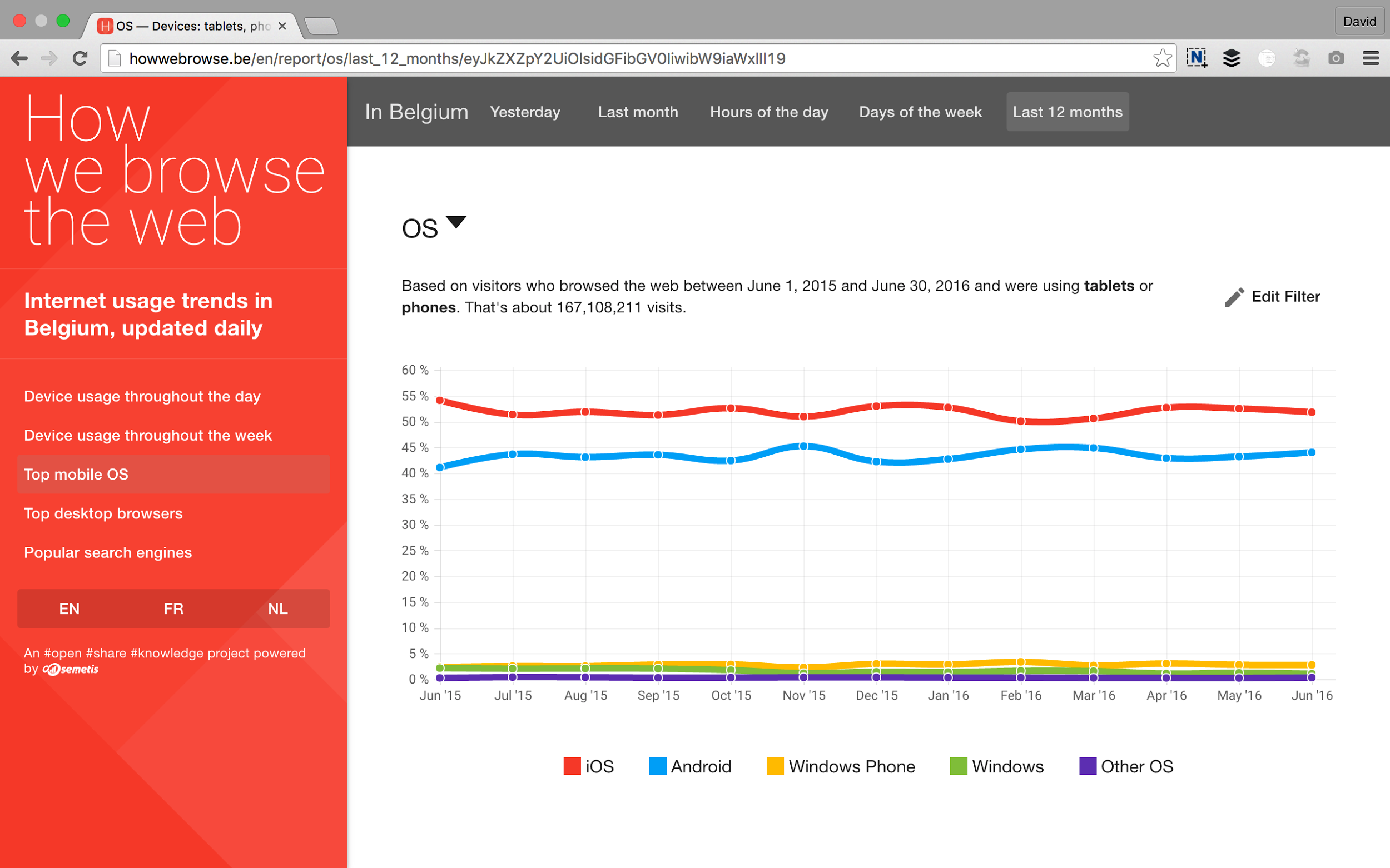
As an example I’ll use HowWeBrowse.be, a website that shows the Belgian internet usage trends, based on aggregated data of some of Belgium’s most visited websites.
Find the information you need
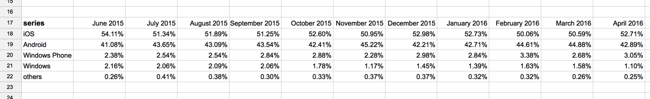
In my report, I would like to add a chart that shows the usage of the most popular mobile OS. The report Top mobile OS on the HowWeBrowse.be website is the ideal source for that chart.
Copy the report’s CSV link
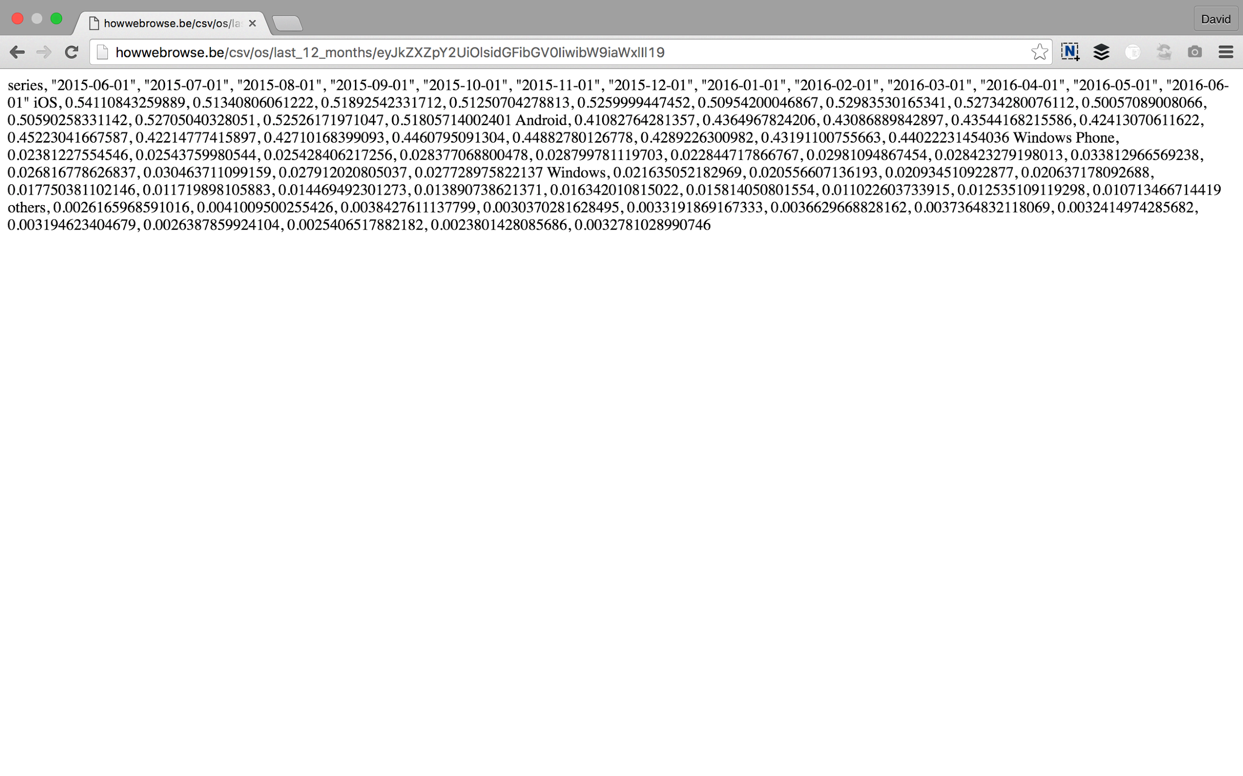
Google Sheets needs CSV or TSV data and in HowWeBrowse.be it’s easy to get the CSV data behind any report. Just replace /en/report/ with /csv/ in the address bar of your browser and HowWeBrowse.be will nicely format the data as CSV for you.
Importing the data in Google Sheets
Now it’s time to head over to Google Sheets. Click in an empty cell and enter the following formula:
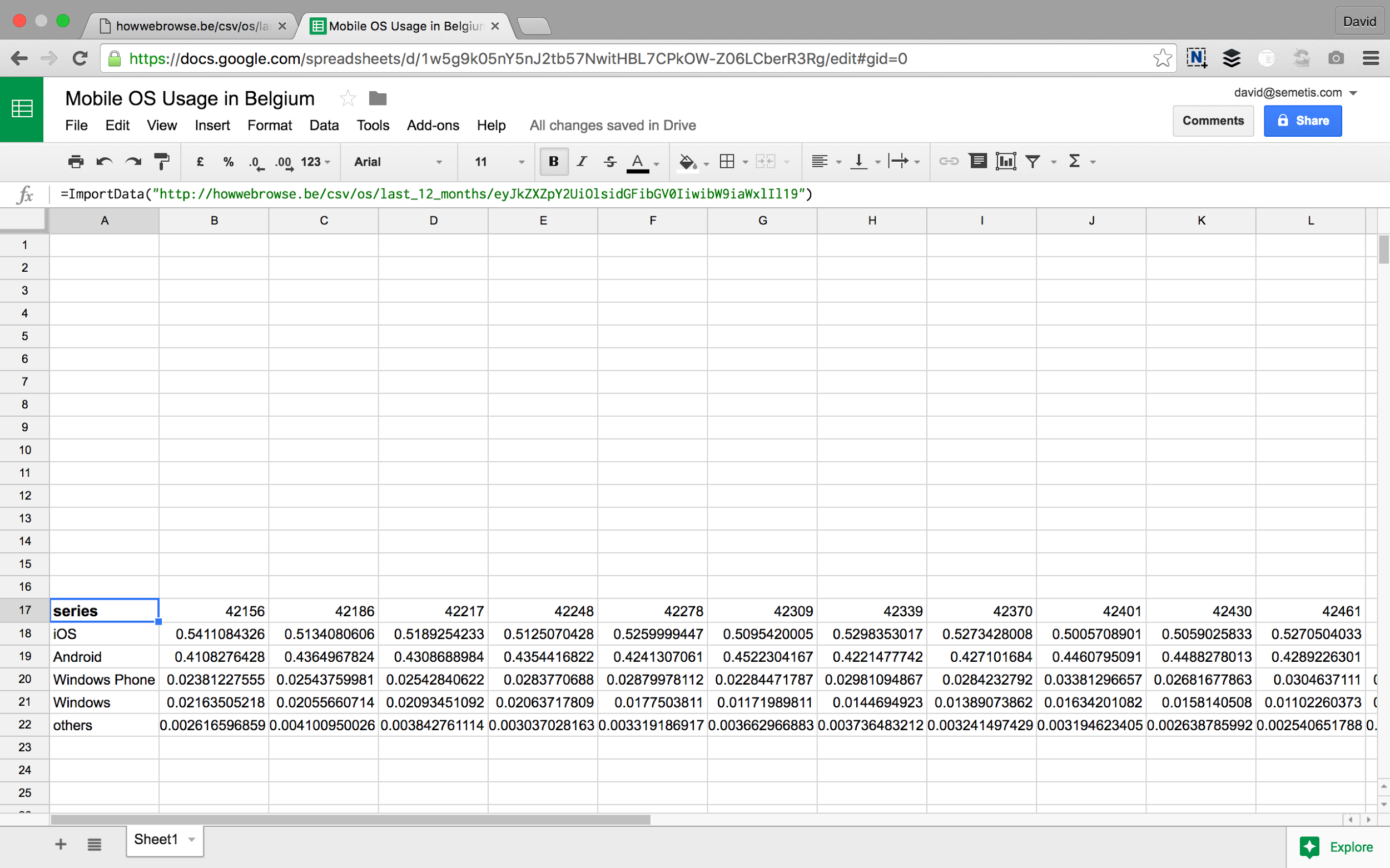
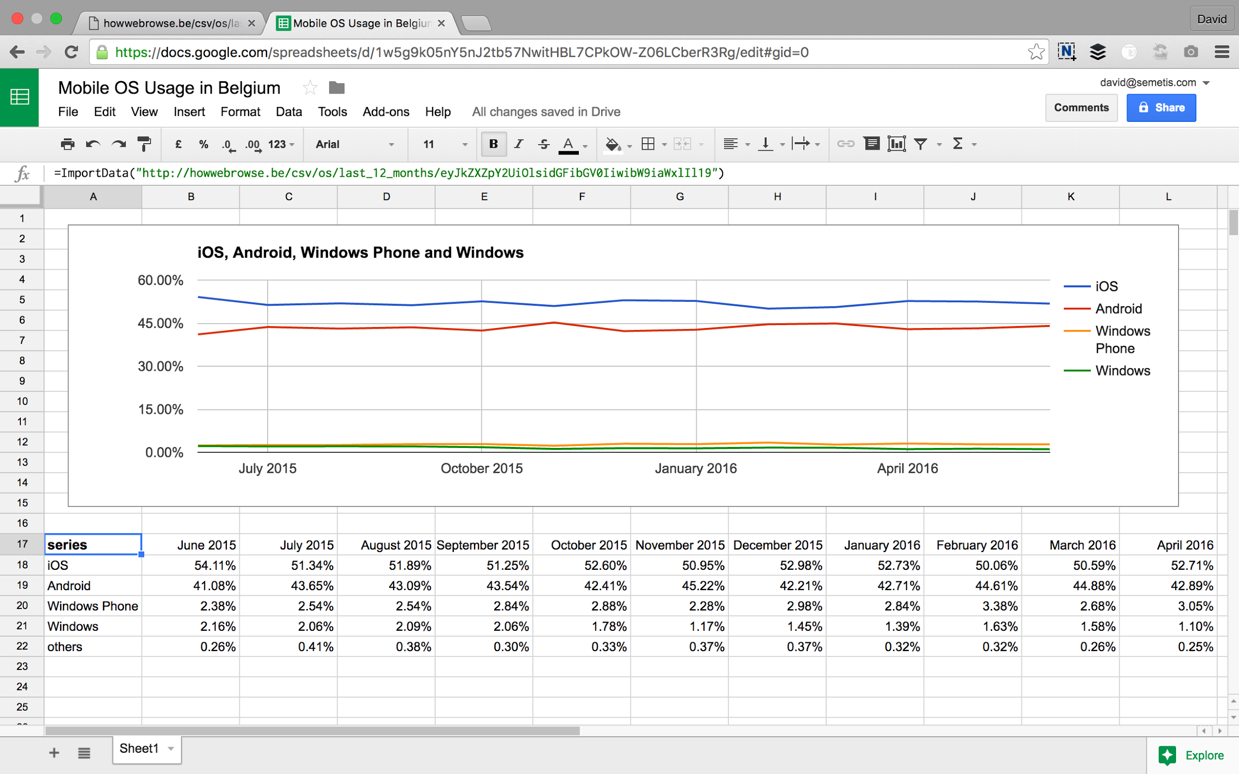
=ImportData("http://howwebrowse.be/csv/os/last_12_months/eyJkZXZpY2UiOlsidGFibGV0IiwibW9iaWxlIl19")
Between the brackets and in quotes is the address that points to the CSV data we got from HowWeBrowse.be. Hit enter and the data will be loaded instantly.
Even better: this data will be updated every hour bij Google Sheets, so the numbers will always be up to date, whenever you open the sheet.
Formatting the data
Now it’s time to make the data a little more readable. We start with the dates in the first row.
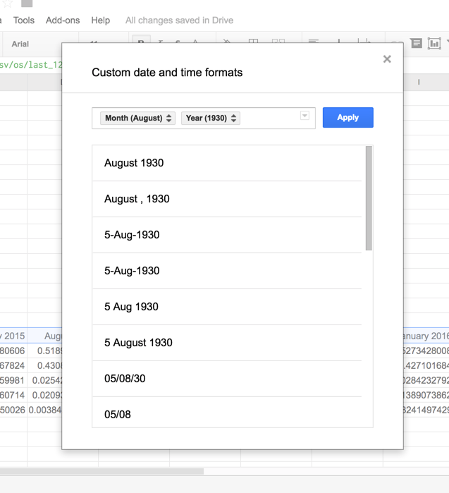
Select the row and choose Format — Number — More formats — More date and time formats…
In the dialog that appears, choose “Month Year” and click Apply.
Next, select all values. As they are percentages, you can format them using the % button in the toolbar. That looks way better, doesn’t it?
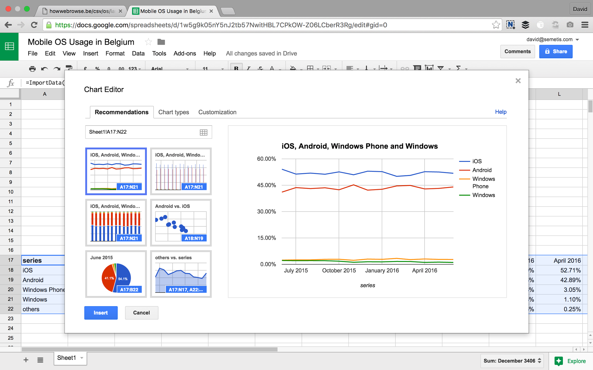
Creating the chart
The last thing we need to do is to create a chart, based on the data from HowWeBrowse.be.
Select all data, including the header rows and click the Insert Chart button. Choose the chart type you like in the chart editor and click the Insert button.
That’s it. You now have a chart in your Google Sheet that’s updated every hour with the latest Mobile OS trends.
Other data sources
On the website http://data.gov.be/en you can find more than 5000 other data sources that you can import in Google Sheets in a similar way.
Author: David Peeters