Why
Many website owners today prefer to have one responsive website instead of a mobile website and a desktop website. Having one website that plays well on all devices, no matter what screen size, has a lot of advantages. Most of the time your tags, like Google Analytics tags for page views can be shared across device types, but sometimes you want to have a tag that’s only fired on a certain device type.
Goal
Today’s goal is to create a tag that’s only fired on tablets. While the Google Tag Manager has a lot of options and variables already built-in, the device type is not one of them. Luckily, Google Tag Manager is very flexible and it’s easy to create a custom JavaScript variable that will contain “desktop”, “tablet” or “mobile” depending on the screen size. When we have created that variable, we’ll be able to use that in the trigger for our tag. Don’t worry it’s easy and you just need a few notions of coding.
Howto
- In Google Tag Manager, go to Variables and click New
- Choose the Custom JavaScript type
- Give the variable a name like Device Type
We’re basing the device type on the width of the device’s screen. Smaller than 321px for mobiles, smaller than 769px for tablets and all above for desktops. Copy and paste the following script:
function()
{
/// the minimum width for each device we're able to detect, from big to small
var deviceMinWidths = {
'desktop': 769,
'tablet': 321,
'mobile': 0
}
/// find the device type
for(var device in deviceMinWidths)
{
if(window.screen.width >= deviceMinWidths[device])
{
return device;
}
}
}
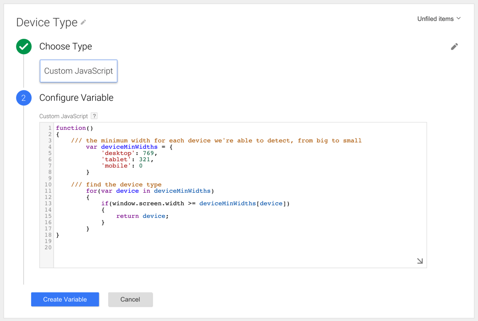
- Click Create Variable
Next we need to create the tag that only needs to fire on tablets
- Go to Tags and click New
- Configure the tag as you normally would
- In the Fire On step, choose for More
- This opens the Choose from existing Triggers dialog
- Click New to create a new trigger
- Name it All pages viewed on a tablet
- Choose the Page View event
- Select the Page View trigger type
- Select our variable Device Type in the list and set equals to tablet
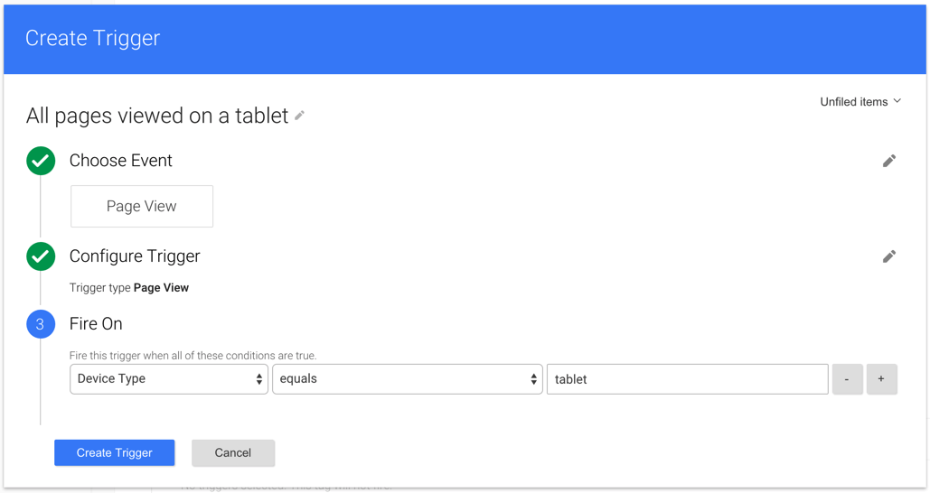
- Click Create Trigger
- Click Create Tag
The tag is created
Result
You’re all done. Don’t forget to publish the changes. The tag should now only fire on page views triggered with tablets.
Author: David Peeters