Introduction
Looker Studio is a Google tool that allows you to convert data from various sources, such as Google Analytics, Meta and Criteo, into clear and interactive dashboards. The platform has numerous functionalities, but when building dashboards, one element is always important: readability.
By default, you work with fields that are linked to the data source, but Looker Studio also allows you to create custom fields. These help you to structure data more clearly and interpret it better. There are three options for this: Calculated Fields, Groups and Bins.
Calculated Fields to add new fields
Calculated Fields are familiar to most Looker Studio active users. Calculated Fields allow you to create a new field in Looker Studio based on a formula that you define yourself. This allows you to perform calculations, combine existing fields or transform data without having to modify your data source.
Typical applications include calculating ratios (CTR, events per session), merging text fields (e.g. first and last name) or performing simple calculations (e.g. profit = revenue - cost). Calculated Fields are mainly used when you need a metric or dimension that is not available as standard in your data source.
A visual example is the CASE function for channel grouping:
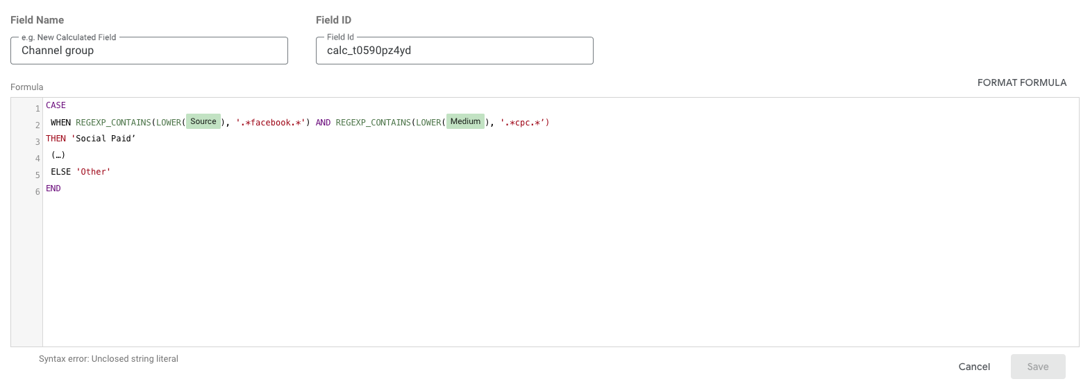
When using CASE formulas, AI tools can be a powerful aid in speeding up the writing process.
Grouping dimension values with Groups
Sometimes a dimension contains many different values, which makes analyses and visualisations unnecessarily complex. By grouping certain values into a number of categories, you can simplify your data. In the past, we had to use Calculated Fields to group certain elements, but today this can be done more easily with Groups.
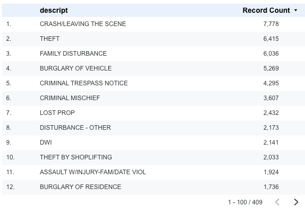
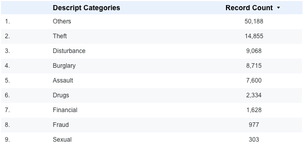
If you want to rename a long campaign name based on language (NL or FR), you can easily do this with a Group Field, without having to write a formula as you would with Calculated Fields. Another concrete example: we have a dataset with the amount of criminal activity per type. This is a long list, and we want to reduce the options by grouping all types of theft (e.g. Theft) into one category.
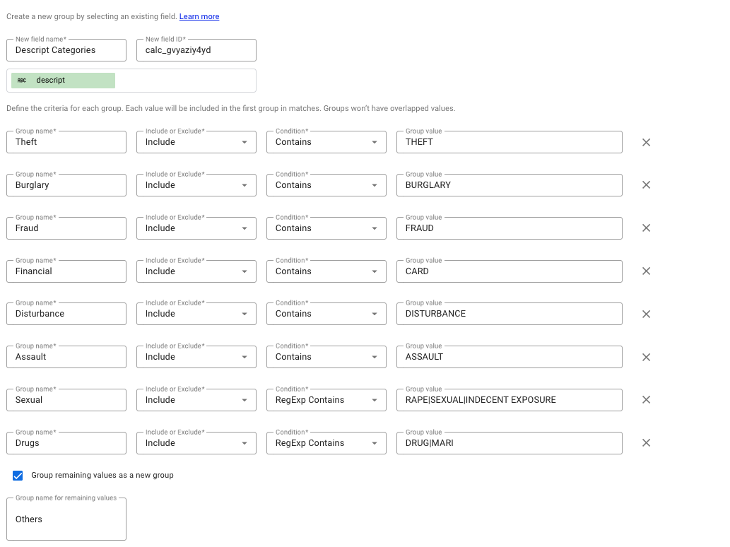
In the right-hand data column, select “Add a Field” > “Add group”. Here, you need to fill in a few fields:
-
New Field name: what you want to call your new dimension
-
Selected field to Group by: which dimension you want to work from
-
Next, you need to compile the criteria for each group. For the example of Theft, we select all dimension values that contain THEFT. You can expand this by adding multiple lines or placing multiple values, separated by a |, on a single line.
-
You also have the option to place the remaining values in a separate category. If you do not do this, these values will retain their original names.
Once saved, we can add this new dimension to the table. We can see that the old values now fall under Theft.
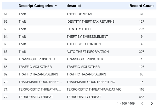
If we do this for all values, we get a clear table that is more easy to read.
Dividing numerical values into categories with Bins
With numerical data, it can be difficult to gain insights from separate, individual values. By dividing numbers into (fixed) ranges (called Bins or buckets), it becomes easier to analyse patterns. This principle is already widely used by marketing platforms today, for example for the age dimension: 18–24, 25–34, and so on.
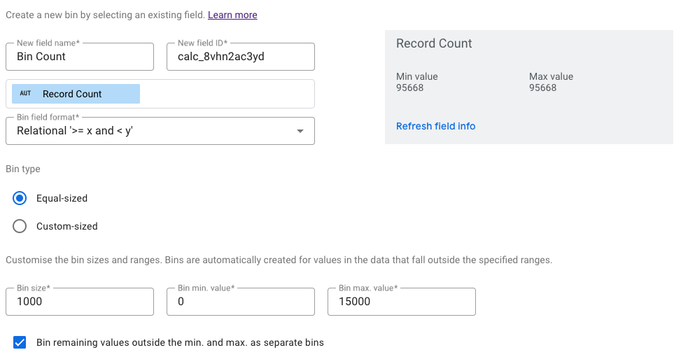
To show how to do this, we will build on the previous example. We want to divide the crime figures into buckets. In the right-hand data column, we select “Add a Field” > “Add bin”. Here we need to fill in a few fields:
-
New Field Name: the new name
-
Selected field to bin by: which dimension/metric do you want to divide into Bins
-
Bin Field format: how the Bins will look visually. There are three options:
-
Interval ‘[x,y)’
-
Integer ‘x to y’
-
Relational ‘>= x and < y’
-
-
Bin type:
-
Equal Size: automatic division into fixed intervals. Here, you determine the start and end values of your Bins yourself.
-
Custom-Size: you determine all bin breakpoints yourself.
-
-
Finally, you can choose to place all values below the minimum and above the maximum in a separate bin..
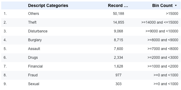
Visually, this results in an overview in which the values are neatly divided into Bins.
Conclusion
Readability is one of the most important success factors for a good dashboard. Looker Studio offers Calculated Fields, Groups and Bins as a way to structure and simplify data.
Calculated Fields help you create new insights through calculations and combinations, Groups provide clarity by bringing similar values together, and Bins allow you to categorise numerical data into clear categories. By cleverly combining these techniques, you can create dashboards that are not only accurate, but above all understandable and useful for every stakeholder.

Lore Fierens
| LinkedinThis email address is being protected from spambots. You need JavaScript enabled to view it.