On April 21 2015 Google started to roll out its mobile friendly update and rumor has it that Bing’s mobile-friendly ranking algorithm is coming soon. Six weeks after Mobilegeddon, the Internet is dominated by articles sharing results of their studies looking at the impact of Google’s update. Many are postulating the same conclusion that the Mobile Apocalypse is an overblown hype. However, a small number of opponents state that the algorithm update is rolling out at a low pace and reiterate that the impact will be as expected in the long run. Due to the lack of evidence whether or not this release is greater than Panda or Penguin, this release continues to be subject of heated debate. Nonetheless, improving the mobile friendliness of your website is not a bad investment advice.
Google announced that the algorithm change is designed to give a boost to mobile-friendly pages in Google’s mobile search results and classify them with a “Mobile-friendly”-label. Strictly speaking the new ranking factor runs on a page-by-page basis not site-wide for searches done on a mobile device. Thus, desktop traffic, tablet traffic and mobile applications are not impacted.
Put yourself to the test
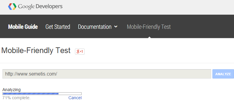
Google Developers provides a tool to test whether your website is mobile-friendly or not by giving an easy-to-understand pass or fail response followed by recommendations when your page has been labelled unfriendly. Once your webpage has been indexed and passed the ultimate test, your organic result will be marked with the “Mobile-friendly”-label. However, to what extent Google will send you more mobile search customers is discussable. The overall idea of Google behind the algorithm is to act in the searcher’s best interest. Webpages deemed unfriendly but providing more relevant content than their mobile-friendly competitors will likely remain in higher search positions.

Have you been hit? To analyze the early effects of Mobilegeddon and to determine to what extent your mobile search ranking has been affected, consider the KPIs listed below. These metrics are good indicators to help you see early signs of fluctuation and to monitor it over the next few weeks.
- Significant changes in mobile organic search visits
- Significant changes in mobile organic search leads
- Significant changes in first-time website visitors through a mobile device
Since “branding” remains a strong ranking factor, the mobile search visits received from branded search queries will likely remain fairly steady. Therefore, analyzing the percentage of brand versus generic search term traffic mobile drives should allow you to gain more accurate insights. It might be in your best interest to examine Webmaster Tools data instead of the organic search terms report in Google analytics. To protect users’ privacy the majority of results in this report are listed as ‘not provided’. This missing data could skew the validity of results.
Give the mobile user the best on-the-go experience
However, the hit you might or might not have encountered should not be your main focus. With mobile traffic having significantly overtaken desktop traffic, investing in giving the mobile users the best on-the-go experience should be key in any scenario. This means avoiding things that might discourage engagement. The following quick wins make up a great checklist to start with. These marginal gains allow you to deliver the best mobile experience possible and to benefit from Google’s new mobile search algorithm.

Redirecting mobile users
Mobile visitors who request a specific page on desktop should be redirected to the corresponding mobile page. When you do not have a smartphone equivalent of a certain page it is recommended to keep the user on the desktop page. To be concise: avoid faulty redirects between mobile and desktop.
Improve mobile page load times
Page loading time is an important part of any website’s user experience regardless the device the visitor is using. Mobile internet users expect a web-browsing experience on their phone that’s comparable to what they get on their desktop. However, because of limited processing power and unreliable bandwidth compared to desktop it is advisable to try to cut down the on-page elements that drive extra HTTP requests.
Build mobile-friendly navigation
Creating a more mobile friendly webpage is to a great extent a matter of making it more accessible and taking the mobile user's needs into account. Remember, visitors are used to scroll up and down a page, avoid users squinting to read content and try not to neglect the “thumb”-rule: touchscreen users’ fingers can’t hover like a mouse. Navigation not only remains a key element, it enjoys a bigger significance when optimizing for mobile devices.
Understand on-mobile user behavior patterns
Mobile has unlocked new moments, particularly “on-the-go”, to be connected. Therefore understanding the audience and the device is fundamental. Imagine your mobile user checking their smartphones to look for easy finds and quick wins when having a spare minute. Optimizing UX by clear and easy-to-follow journeys is the way to go. However, stripping back is not the answer if it causes confusion or complexity.
If you would like to take the responsibility to not settle for a bad experience on mobile, deep dive into the “SEO Mobile”-manual provided by Google Developers. This excellent overview will help you optimizing your configuration.
Looking beyond Mobilegeddon
Surviving the change swept through Google ranking algorithms is all relative. Yet, adjusting your website around the mobile user and his needs should be a key part of your mobile strategy. Failure to do so could lose your ranking compared to your competitors in time according to Google’s Mobilegeddon. Another way of looking at this is to go beyond just caring about your mobile ranking; it’s a reminder at how smartphones are driving force behind the mobile transformation and how your clients and potential clients are engaging with your brand on such devices.
![]() écrit par Dhan Claes
écrit par Dhan Claes


