
There are graphs and graphs and obviously Envisioning Information, which is an art. Working in the digital marketing industry makes our day full of data. Our challenge as a Digital Advertising and Digital Business Intelligence agency is to transform data into knowledge and then, being able to communicate it. That expertise becomes a competitive advantage for our clients in the way they can take the best business decisions.
A couple of months ago, I went across an interesting graph from the Corriere della Sera (15/09/2014):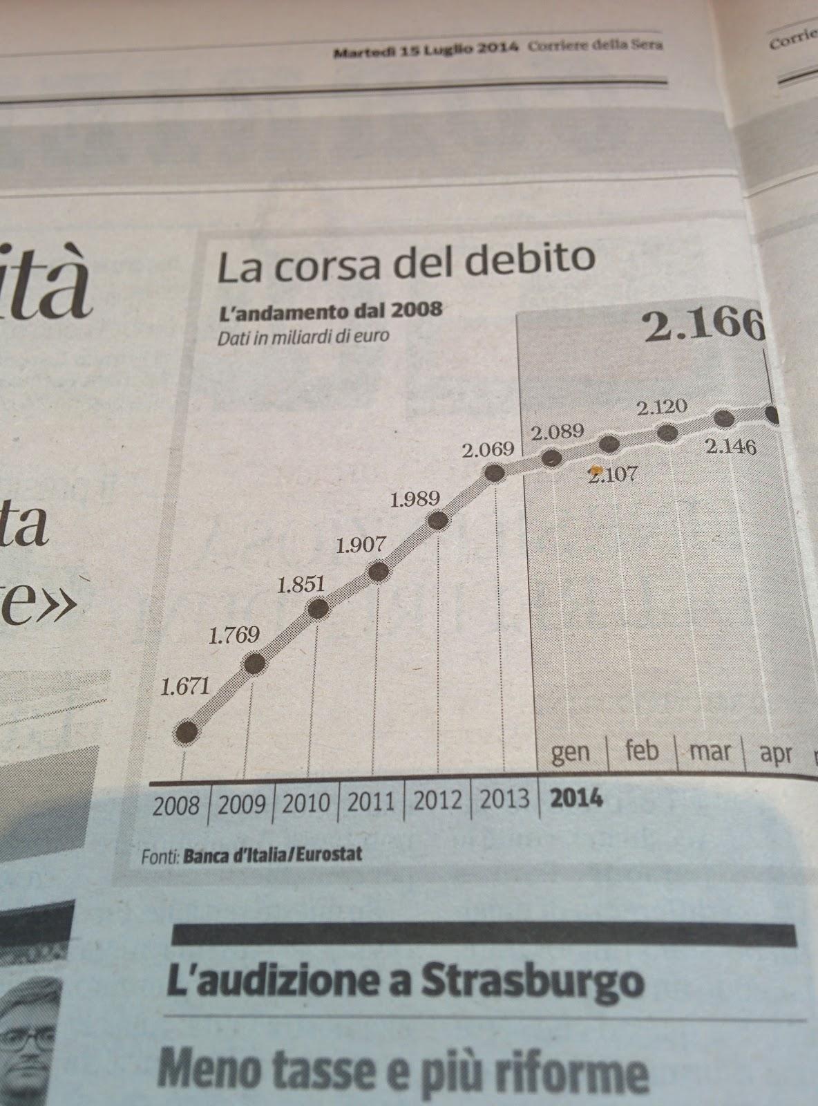
It shows the evolution of the Italian debt in billion euro. The graph is pretty clean and clear. The debt is booming. But something caught my eyes.
Why this graph is so easy to understand?
- The line graph gives a clear understanding of the trend (even though the debt evolution is not linear throughout a year - see below point 1 What’s wrong with this graph?);
- Data points darker color contrast smoothly with the line;
- Data label are easy to read;
- Latest data label (2.166) bigger police size makes it stand out as where we stand now;
- No repetitive Y axis markups thanks to labelled data points;
- X axis, 2014 in bold stands out;
- Darker background to emphasis 2014 period.
What’s wrong with this graph?
- A bar chart would have been more accurate (as the debt evolution is not linear throughout the year) but the thin lines between the data points and the year on the X axis is an interesting trade-off.
- The scale of the Y axis seems the exaggerate the evolution of the debt. Indeed, between 2008 and 2013, the debt increased by 23,82%. Looking at the graph, on the Y axis, it starts slightly below the first data point (1.671). It gives the idea that the debt grew by 5-6 times till 2013!
- Another point, is how we switch from a yearly scale (2008 - 2013) to a monthly scale. It creates two biais. The first bias comes from the Y axis. The debt evolution is overstate. The growth between 2013 and May 2014 is about 4,69% while visually it seems much more. The second bias comes from the X axis. It gives a feeling of an infinite growing debt in 2014 because the months are considered like the years on the X axis.
Data Visualization matters
As you can now see much work is, and should be, put behind a simple graph. Spotting the beauty, the effectiveness and the intelligence is nowadays required for anyone working in our industry. Otherwise you might miss the quality of the work, its beauty and, above all, you might be fooled and miss the story behind the data. That is why we use to say “data makes better opinions”!
![]() written by Nicolas Debray
written by Nicolas Debray