Semetis, being a full stack Digital Advertising and Digital Business Intelligence agency, is facing continuous challenges within a non-stop evolving industry.
Digital Advertising Budget Monitoring:
Monitoring budgets is one of these challenges. Budgets are a precious treasure of our clients. They give them to us and trust us to smartly invest them and generate even more than the business objectives they set.
Digital Advertising experts have seen the rise of many new paid acquisition channels within the last 10 years. Search, Display, Video, Native Ads bought in direct deals, in real time bidding, with audiences, in remarketing, on mobile, … Facebook, Instagram, Twitter, AdWords, Bing, Linkedin, DoubleClick, …
As a consequence budget monitoring has become tremendously intense.
Identifying Opportunities:
When I asked people at Semetis how they use to check budgets, I realized that everyone has his own routine. From using a calculator to an excel, automated or not, sheet. But everyone was doing it, at least twice a week. There was obviously wasted time to be optimized.
Technology backbone:
At Semetis, we use to say that technology is our backbone. It’s not the answer though. It’s part of the answer. So I asked two eBusiness Analysts from our Digital Business Intelligence Team to think about how could we streamline such an important task.
Understanding the need:
To come up with a great solution, a lot of time and thinking is required. Step one was empathize with the user. In a second step, they started looking for a better understanding of the need? A need of control? A need of planning? A need of reporting? Why do you want to monitoring your budget? Why do you check so often or at such specific times? Why do you estimate the future media spend that way? Etc.
From Excel to a Web Application:
Based on the information collected, they were able to test some simple solution with Excel and Google Sheet. Indeed, before rushing to the Web Developer and asking him to build a cool web application, it was important to first test on some automated excel. This step is crucial. First, for understanding the metrics that matter and then, second, the logic behind: which data to collect, how to structure them, how to store them in tables, how to use them, how to display them, how to update them, and so on.
A few weeks later, they were ready to go to the Web Developer and start the next phase of the project: building a simple yet great piece of technology.
The magic - How it works:
So easy. You open your favorite web browser (latest stats for Belgium on howwebrowse.be) and login. You create a Budget, with a start and end date, for the Advertiser you selected. Then, you define the data source (ie AdWords, Facebook,...) and the campaigns, within that data source, that you want to monitor. That’s it. Simple, isn’t it?
The magic - Simplicity hidden in the details:
On the back-end, we use the Google AdWords, Facebook and DoubleClick API to get automatically and almost in real time the cost data.
On the front-end, we focused on displaying the most simple output to the end user with an easy way to understand, easy flow to create or update any budget you want to monitor.
From a user perspective, you create a Budget, with a start and end date, for the Advertiser you selected. Then, you define the data source (ie AdWords, Facebook,...) and the campaigns, within that data source, that you want to monitor. That’s it. Simple!
What were our biggest challenges for the front end?
Which KPI? One or many (for example: Budget spent so far or Budget remaining or Budget total or Pace or Forecast or Recommendations or all at the same time?
How did we solve this issue? From the beginning we limited the information as much as possible. Hereunder a few bits on how we made it.
Hiding secondary information:
For instance, we hide some data. Only when you mouseover, you will you start seeing the information:


Indeed, knowing how much did you spend so far and out of a total budget of, is not something you need to see all the time. Actually, our findings were that what matters the most is: Am I on track or not?
Leveraging colors for great data visualization:
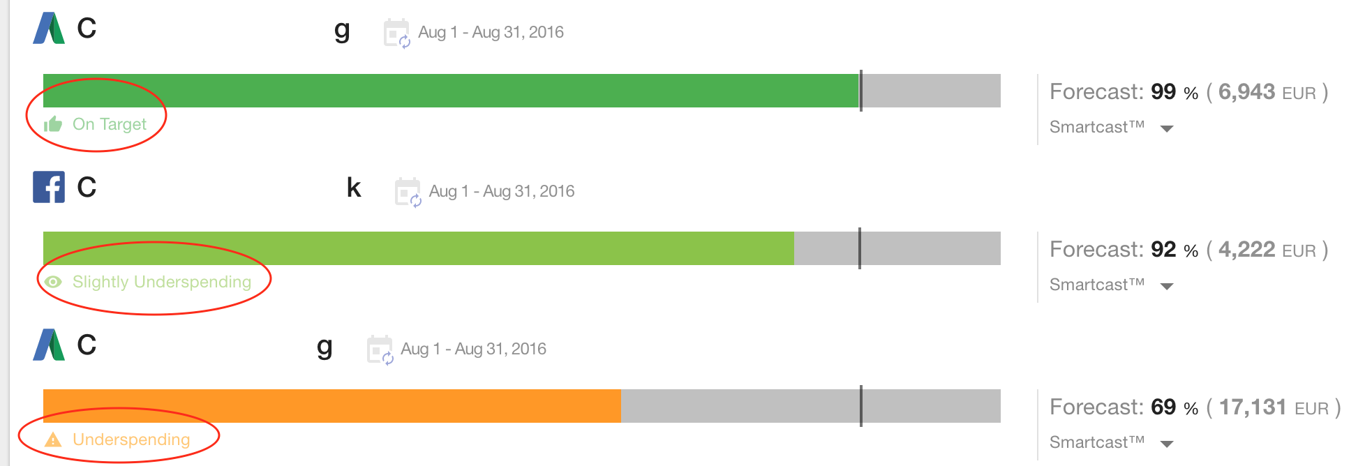
Another example is how we played with the colors to better visualize the information. As you can see in the screenshots below, we added the period of the budget. The period is rather a secondary information. We decided to reduce the font size and to give it a light grey color. It helps the name of the Budget (here “Monthly Budget”) to stand out.

You can also see this into action at the right hand side of the bar for the Forecast. What matter here is the value in percentage (see below). We gave to the percentage a black tone which directly stands out.

Colors and psychology:
A last example, psychological researches have demonstrated that the impact of a negative news, whatever its amplitude, can be up to 4 times more impacting that a positive news (negativity bias).
In our interface, the most eye-catching element is the colored bar graph. At first we started with OK (plus and minus 5%) in green and Not OK (outside the OK zone) in red. So a rather binary simplistically approach. As a consequence, with the fluctuations, we had often Red alarming bars which gave a feeling of emergency and unnecessary stress.
We decided to enlarge our colors palette. We went from 2 to 4. If the budget is depleted before the end date, it will be displayed in red. When we are clearly over- or underspending we use a light orange. For moderated values above or under a light green is used (slightly over- under-spending). And, when we are on target, we use a solid green.

Forecasting Media Spend:
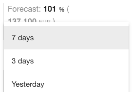
We decided to focus on the Forecast as being the main KPI. Again, our lean approach brought us to start with a very easy, yet intuitive, way to estimate it. Our Forecast metric was simply based on the Last x days: Last 7 days, Last 3 days, or Yesterday. It may sound very naive but we wanted people to adopt the tool. Understanding the estimate calculation and so its potential error, definitely helped people to feel comfortable with the Forecast and the information behind this KPI.

Smart Intelligence in the Engine:
We saw a great adoption of the App from the beginning. We decided to improve it and try to become more accurate when it comes to forecasting.
We worked on several models with two goals in mind: Improve accuracy & Keep it intuitive. Improving accuracy was the minimum. Our mindset was not to aiming for the perfect algorithm but rather for improvements. We benchmarked our models with the past performances of many campaigns to pick up the best one, minimizing the error.
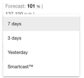
To keep it intuitive, we mainly focused on integrating a simple seasonality (for instance: day of the week) factor and a simple trend element (for instance: yesterday spend). Finally, we released it as being an extra choice for the user. We called it “Smartcast”!

What’s next?
Today, we’re happy of our internal adoption rate and the usage. Intuitive, fast and accurate. These are our main challenges for the coming few months. Keep the App simple, make it load super-fast and improve its main mission to monitor budgets by better forecasting their spend evolution.
Author: Nicolas Debray


