
The right person at the right moment with the right message. A sentence every marketer has heard at some point. On Meta, you have a whole list of interests to choose from in order to reach the right people, but if your advertisement is not optimal, endless optimizations will not turn the tide. According to the Advertising Research Foundation (ARF), 75% of the results of your advertisement are influenced by your creatives.
Strong creatives can make a difference. That's why it's best to ask yourself 4 questions before publishing your ad:
- Does my branding come across sufficiently?
- Are my ads concrete and clear?
- Does my objective align with my message?
- Do my ads fit the different Meta placements?
1. Does my branding come across sufficiently?
If your message reaches the right people, you want to make sure your brand is recognizable. By using the right brand colors and typography, you can immediately improve recognition. If you can incorporate your logo in a (natural) way, that's an added plus. Especially in videos, it's important to show your logo within the first 5 seconds. A voice saying your brand name is not a good replacement since the majority of Meta users watch videos without sound. Always design an ad without sound by adding captions or by not speaking in the video. The exception to this rule is Reels, which most people watch with sound according to data from Meta.
2. Are my ads concrete and clear?
An ad should always be concrete. Your target audience probably doesn't want to read a bible alongside your advertisement. When we talk about ad text, we refer to it in various ways:
- Your ad text with your image
- Your text on your image and video
- Additional elements like your headline
The rule simply applies to any kind of text. Your text and headline will be shortened by Meta if they are too long. So even though Meta doesn't really have a maximum number of characters, keep in mind the recommendation as much as possible. For a standard ad, this is 125 characters for your text and 27 for your headline. Don’t you manage to stay within 125 characters or is it just barely succeeding? Then still try to display your main message as quickly as possible or open with this so that it is not cut by Meta.
For your images, you have the 20% rule that says images with more than 20% text perform less well. This rule is a point of debate. This is because it is questionable to what extent Meta effectively takes this into account. However, even if the amount of text does not impact the algorithm, it is still best to take this rule into account. Only the essence belongs on your image.
3. Does my objective align with my message?
"Visit our stores!" is not an appropriate call-to-action if you want to encourage online purchases. If you want people to view something on your website, don't encourage them to visit your physical shop at the same time. Keep your ad copy specific and clear, as the second point highlights.
Clearly state what you expect from your target audience without exaggeration. Do they need to view something on your website? Then mention that they can find more on the website. A subtle encouragement in the right direction can't hurt. Moreover, this helps to better distinguish the different stages of the marketing funnel.
Another aspect of your message is an appropriate landing page. Does it match your objective? An optimal landing page leads to a better conversion rate. Also think about the option of not adding a landing page, for example with a video to create awareness.
4. Do my ads fit the different Meta placements?
One of the Meta recommendations is to use advantage+ placements. By indicating this, you automatically appear on the entire Meta network. If you prefer a little more control over where and how you appear, aim for a minimum of 6 placements and make sure your creatives are adapted to the placements. You can easily achieve this by always supplying all your images in 3 formats:
- Square format (1:1) or portrait format (4:5)
- Story format (9:16)
- Landscape format (16:9)
By using these 3 formats, you always have the appropriate format for the right ad placement. A Story or Reel looks better and fits better in the 9:16 format than a square format.
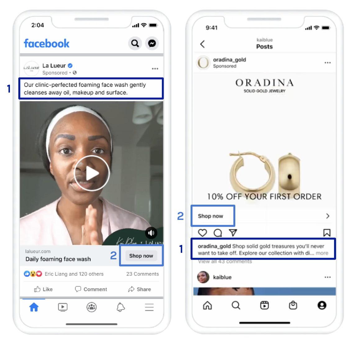
When writing text or designing images, always keep in mind that your ad will not appear in the same way on every placement. Two examples are the placement of the ad text and the CTA:
- The text on Facebook is above the image, while on Instagram it's below. Ending your copy with a symbol pointing to the image is not a clever idea.
- Your CTA text on Facebook is on the right, while on Instagram it's on the left.
Conclusion
The success of an advertisement is largely determined by the message it conveys. Strong creatives can make a difference and lead to better results. To ensure that your advertisement is effective, it is important to ask 4 questions before publishing it:
- Does my branding come across sufficiently?
- Are my ads concrete?
- Does my objective align with my message?
- Do my ads fit the different Meta placements?
By consistently considering these four questions and ensuring that the answer to each of them is a clear "Yes," you can easily optimize your Meta creatives and significantly improve your results.

Lore Fierens
| LinkedinThis email address is being protected from spambots. You need JavaScript enabled to view it.